
A visual guide to photo filters

Last updated: 2026-11-02

Photo filters change the appearance of an image with a single selection. Some strengthen color, some soften the light, and others turn a color photo into black and white. Image Editor provides 23 filters, along with Original to remove the selected filter.

This guide uses public-domain nature photographs to show the differences. Each before-and-after pair uses the same framing. Select a photo to view it at full size, or use the source link in its caption to download the original and follow along.

Choose a filter and set its intensity

  1. Open Image Editor and choose a photo from your computer or phone. You can also drag a photo onto the page.
  2. Choose Filters beside the image. The thumbnails show the available filters on your photo.
  3. Select a filter, then move Intensity left for a lighter effect or right for a stronger effect.

Intensity runs from 0 to 100. Selecting a filter sets it to 100; choosing another filter replaces the previous one and returns Intensity to 100. At 0, the selected filter has no visible effect.
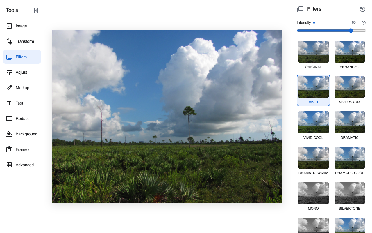
Image Editor with Filters selected, Vivid outlined in blue, and Intensity set to 80 above the filter thumbnails.
The Filters panel. Select a thumbnail to apply a filter, then use Intensity above the thumbnails to change its strength. Scroll down the panel to see more filters. Here, Vivid is selected at Intensity 80.Photo: James Lyon/USFWS. Public domain. Edited in Image Editor.

Most examples below use Intensity 80 to make the effect easy to see. The black-and-white examples use 100, as do Sepia and Blues. Each example starts with the adjustment sliders at 0. Try a lower intensity if a filter changes your photo too much.

Balance the light with Enhanced

For a photo that looks dim or flat, Enhanced adjusts the balance of light and dark based on the tones in the image. The result depends on the photograph, so the change may be stronger in one image than another.
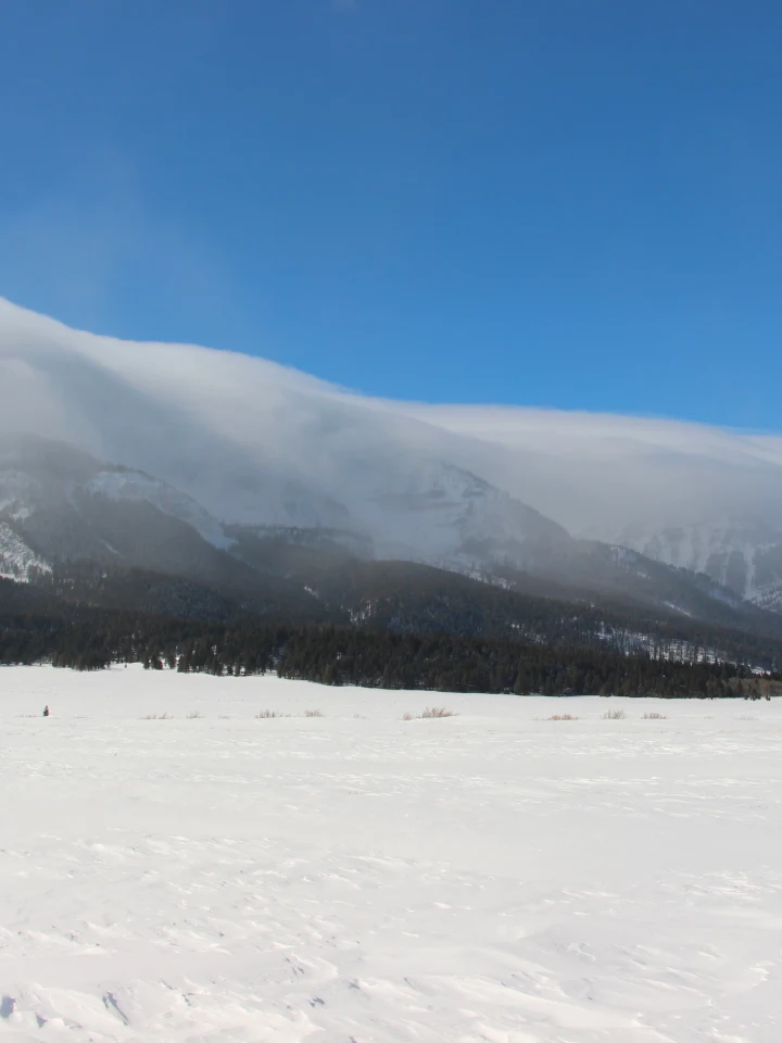
A snowy field below a cloud-covered mountain ridge and blue sky.
Before Low cloud covers the mountain ridge above a snowy field. The forest and distant slopes look muted.Photo: Cortez Rohr/USFWS. Public domain. Portrait crop.
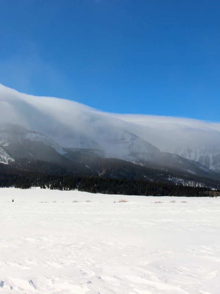
The same snowy landscape with a deeper blue sky, brighter snow, and a darker forest after Enhanced.
After: Enhanced, Intensity 80 The blue sky deepens, the snow becomes brighter, and the forest stands out more clearly beneath the cloud.Photo: Cortez Rohr/USFWS. Public domain. Portrait crop. Edited in Image Editor.

Enhanced is separate from Auto Adjust in the Adjust panel. Enhanced is a filter controlled by Intensity. Auto Adjust sets the individual adjustment sliders, which you can then change yourself. For examples of those controls, see the photo adjustments guide.

Change color and contrast

Vivid

Vivid increases color and contrast to help colorful subjects such as flowers, foliage, and birds stand out.
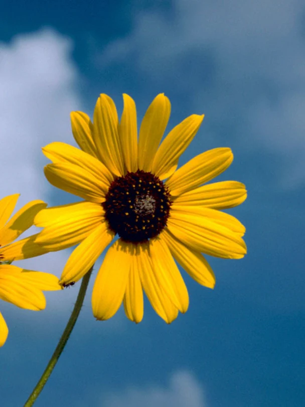
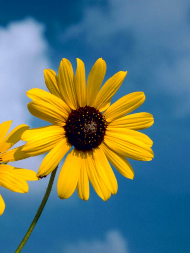
A yellow sunflower against a blue sky with pale clouds.
Before A yellow sunflower against a blue sky. Compare the petals, the dark center, and the blue behind the flower.Photo: Gary Stolz/USFWS. Public domain. Portrait crop.
The same sunflower with stronger yellow petals, a deeper dark center, and richer blue sky after Vivid.
After: Vivid, Intensity 80 The yellow petals and blue sky gain color, while the dark center becomes deeper. The stronger contrast makes the flower stand out.Photo: Gary Stolz/USFWS. Public domain. Portrait crop. Edited in Image Editor.

Vivid warm adds a warmer balance to the stronger color and contrast. Vivid cool shifts the balance toward blue. Chrome offers another combination of stronger color and contrast with a slightly cooler tone.

Warm and Cold

Warm shifts the photo toward yellows and reds, adding warmth to autumn leaves, dry grasses, or a landscape in late-afternoon light. White clouds and other pale areas take on the warmer tone as well.
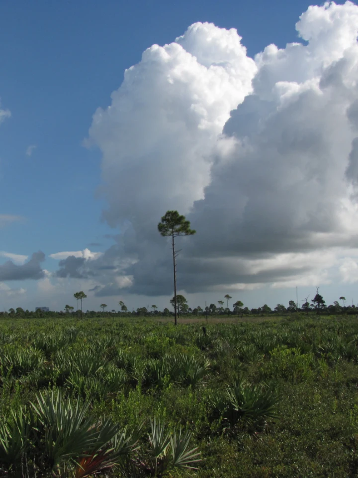
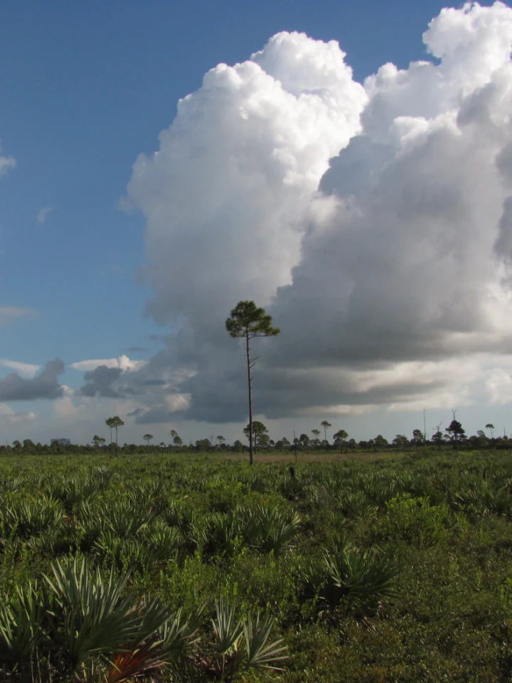
White cumulus clouds above green scrub and a slender tree.
Before White cumulus clouds rise above green scrub at Merritt Island. The clouds provide a reference for the color balance.Photo: James Lyon/USFWS. Public domain. Portrait crop.
The same clouds and scrub with warmer cloud tones and more yellow in the foliage after Warm.
After: Warm, Intensity 80 The clouds and foliage shift toward warmer tones. The green scrub takes on more yellow, while the sky remains blue.Photo: James Lyon/USFWS. Public domain. Portrait crop. Edited in Image Editor.

Snow, water, and shaded landscapes take on a cooler color balance with Cold, which shifts the photo toward blue. The same cloud scene is used below so you can compare the warmer and cooler results.
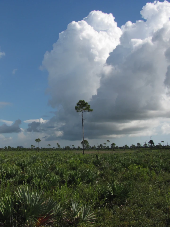
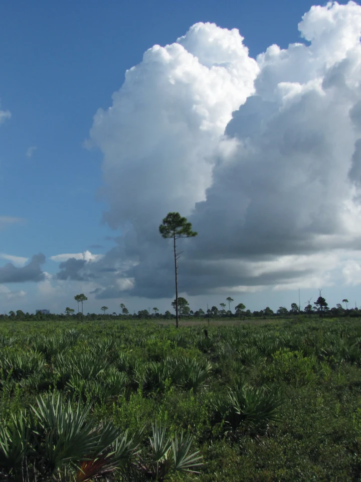
The unfiltered cloud and scrub scene used for the Cold comparison.
Before The same scrub landscape with the filter removed. Compare the cloud color with the Warm example above.Photo: James Lyon/USFWS. Public domain. Portrait crop.
The same scene with bluer clouds and sky after Cold.
After: Cold, Intensity 80 The clouds and sky take on a cooler blue tone. The greens also look cooler than in the Warm version.Photo: James Lyon/USFWS. Public domain. Portrait crop. Edited in Image Editor.

Increase contrast with Dramatic

Dramatic increases the separation between light and dark while reducing color slightly. Rock formations, textured clouds, and landscapes with clear areas of sun and shade show this effect well. The stronger contrast can make detail in the darkest areas harder to see.
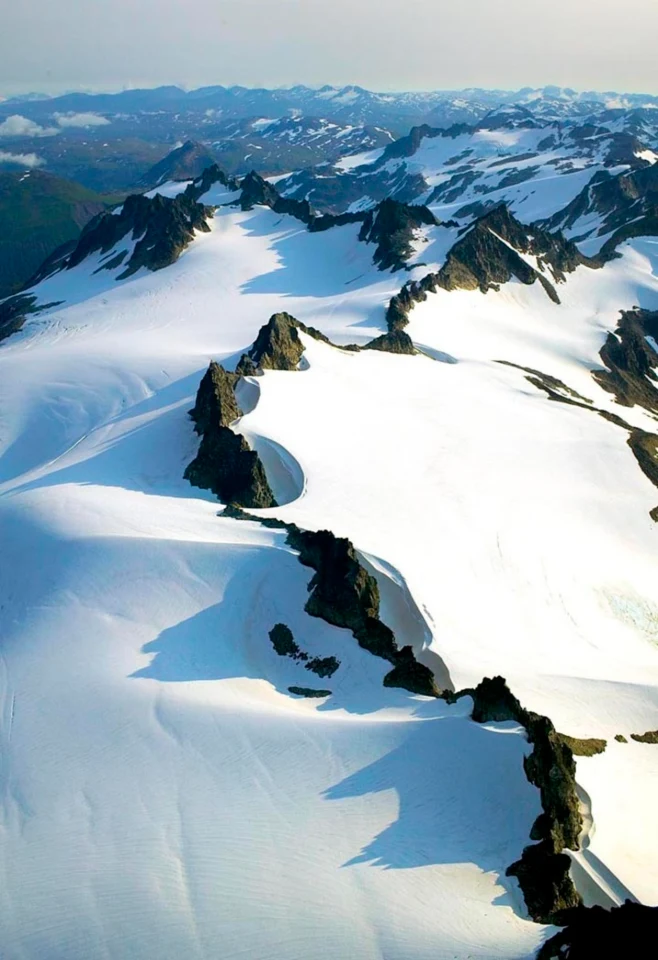
Snow-covered mountain peaks viewed from above, with white slopes and blue shadows.
Before Sunlit snow and blue shadows surround the dark mountain peaks. Compare the ridges with the broad white slopes.Photo: Steve Hillebrand/USFWS. Public domain.
The same snowy peaks with darker rock and stronger separation between sunlit and shaded areas after Dramatic.
After: Dramatic, Intensity 80 The dark ridges and bright snow separate more strongly. Some of the shaded rock becomes very dark at this intensity.Photo: Steve Hillebrand/USFWS. Public domain. Edited in Image Editor.

Dramatic warm adds a warmer color balance to this effect. Dramatic cool adds a cooler balance. Use the neutral Dramatic filter first, then compare the warm and cool versions if the scene would benefit from a change in color.

Remove color to emphasize light and shape

Mono

Mono converts the photo to black and white with a modest increase in contrast. It is a useful starting point when you want to emphasize the shape of a tree, the pattern of leaves, or the light across a landscape.
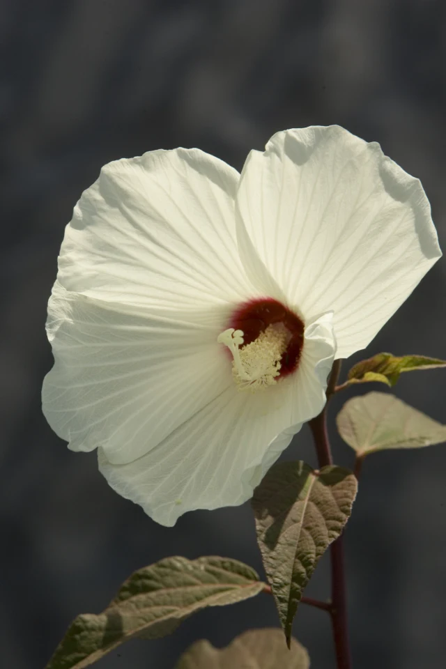
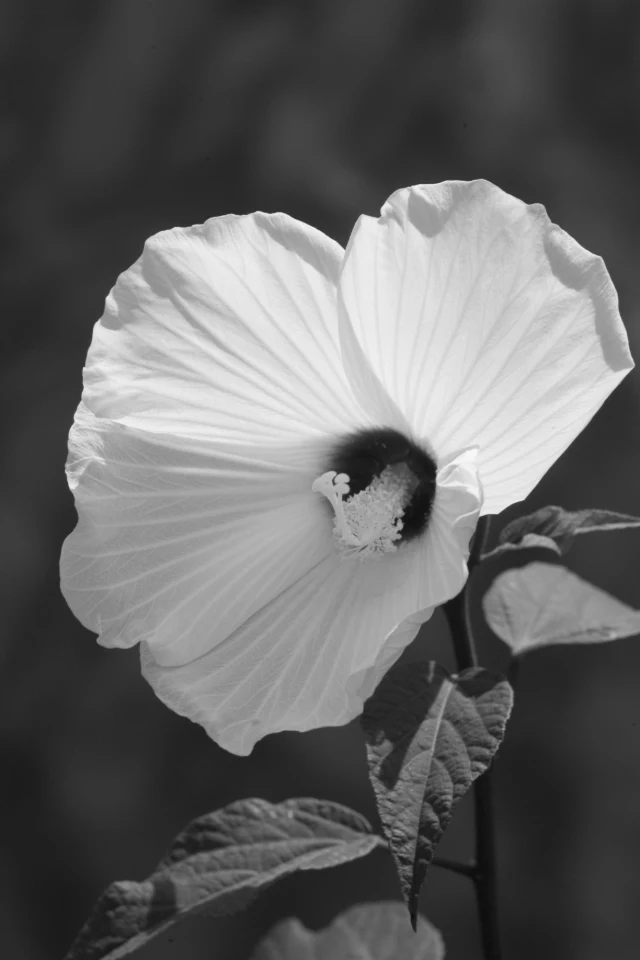
A pale cream flower with a dark red center above green-brown leaves.
Before A pale flower with a dark red center and green-brown leaves. The petals already stand out against the shaded background.Photo: Steve Hillebrand/USFWS. Public domain.
The same flower and leaves in black and white after Mono at full intensity.
After: Mono, Intensity 100 The colors become shades of gray. The folds in the petals and the pattern of the leaves remain visible.Photo: Steve Hillebrand/USFWS. Public domain. Edited in Image Editor.

Noir

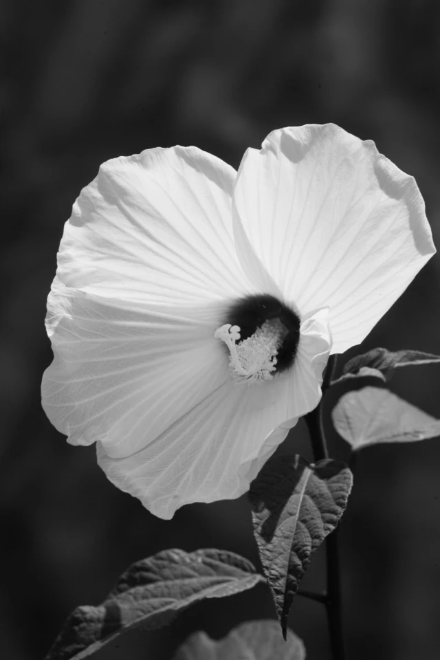
Noir converts the photo to black and white with much stronger contrast and deeper dark tones than Mono. This can emphasize a clear outline or a strong patch of light.
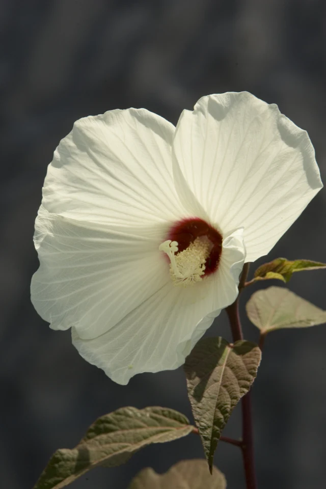
The unfiltered pale flower used to compare Noir with Mono.
Before The same flower, with the filter removed. This makes the stronger contrast of Noir easier to compare with Mono above.Photo: Steve Hillebrand/USFWS. Public domain.
The same flower in black and white with bright petals against deeper dark tones after Noir.
After: Noir, Intensity 100 The background and lower leaves become darker while the pale petals stay bright. The flower stands out more strongly than in Mono.Photo: Steve Hillebrand/USFWS. Public domain. Edited in Image Editor.

For a different balance, Silvertone combines black and white with lifted shadows and more contrast than Mono. Classic mono also lifts shadows slightly. Classic noir produces stronger contrast with darker shadows. Stark makes the separation between dark and light especially strong, while Wash lowers contrast and lifts the darkest tones for a paler result.

Use Intensity 100 for a fully black-and-white result. Below 100, some of the photo's color returns. This can be useful when you want subdued color instead of removing it completely.

Soften contrast and color

Fade

For a gentler appearance in a scene with strong shadows, Fade softens contrast, lifts the darkest tones, and reduces color, with a slight warm tint.
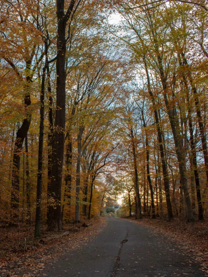
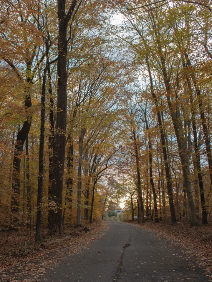
A shaded road through autumn trees with dark trunks and orange and yellow leaves.
Before Autumn leaves surround a shaded road at Patuxent Research Refuge. The tree trunks are dark against the foliage.Photo: USGS, Eastern Ecological Science Center. Public domain. Portrait crop.
The same autumn road with lifted dark tones and more subdued foliage after Fade.
After: Fade, Intensity 80 The dark trunks and road become lighter, and the orange and yellow leaves lose some intensity. The scene has softer contrast.Photo: USGS, Eastern Ecological Science Center. Public domain. Portrait crop. Edited in Image Editor.

Pastel

Pastel reduces color and contrast while brightening the photo and its shaded areas. Flowers and foliage become paler, with less separation between light and dark.
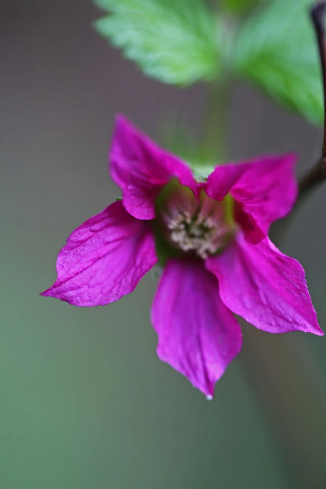
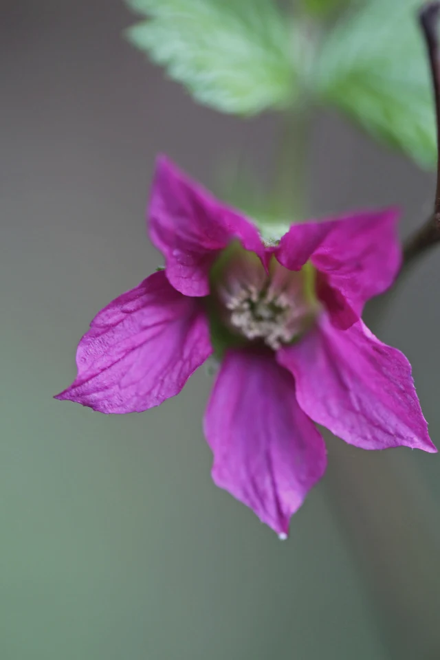
A magenta salmonberry flower below a green leaf against a blurred background.
Before A salmonberry flower with magenta petals and a green leaf. The bright colors stand out from the soft background.Photo: Peter Pearsall/USFWS. Public domain.
The same salmonberry flower with paler magenta and green colors and a lighter background after Pastel.
After: Pastel, Intensity 80 The magenta petals and green leaf become paler. The lighter background also gives the whole photo a softer appearance.Photo: Peter Pearsall/USFWS. Public domain. Edited in Image Editor.

Use sepia and other color tones

Sepia

Sepia replaces the photo's colors with warm brown tones. It can bring attention to texture and shape while giving the image a warmer appearance than black and white.
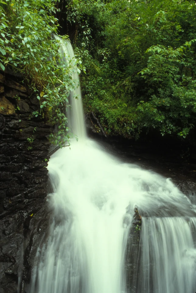
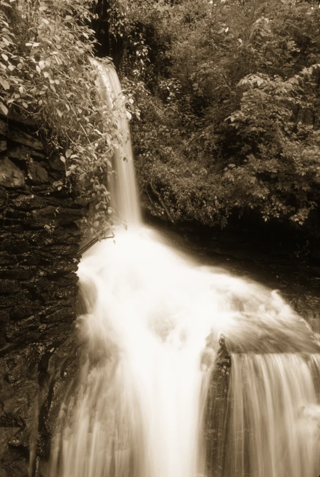
A waterfall flowing over dark rocks surrounded by green foliage.
Before A Georgia waterfall surrounded by green foliage and dark wet rocks. Look at the different greens around the water.Photo: George Gentry/USFWS. Public domain.
The same waterfall and foliage in warm brown tones after Sepia at full intensity.
After: Sepia, Intensity 100 The greens are replaced by warm brown tones. The pale water and dark rocks still define the shape of the waterfall.Photo: George Gentry/USFWS. Public domain. Edited in Image Editor.

Color sepia adds a brown or golden warmth while keeping more of the original color. Differences between the photo's colors remain visible.

Rust

Rust combines strong warmth with higher contrast and darker shadows. Use it to emphasize reddish rocks, autumn leaves, or dry grasses. Pale areas also take on more color.
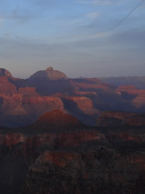
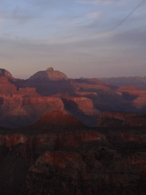
Red rock formations in the Grand Canyon beneath a cool blue-gray sunset sky.
Before The Grand Canyon at sunset. Red rock formations sit below a cool blue-gray sky.Photo: Thomas M Gushue/USGS. Public domain. Portrait crop.
The same canyon with warmer red rocks, a pink-brown sky, and deeper shadows after Rust.
After: Rust, Intensity 80 The rocks look warmer and redder, and the sky takes on a pink-brown tint. The foreground shadows also become deeper.Photo: Thomas M Gushue/USGS. Public domain. Portrait crop. Edited in Image Editor.

Blues

Blues replaces the photo's colors with blue tones. Like Sepia, it emphasizes light and shape, but with a cooler appearance. At lower intensity, some of the original colors mix back in.
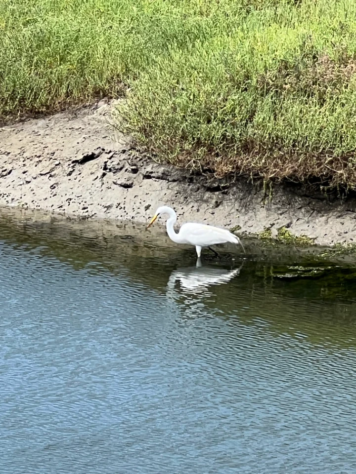
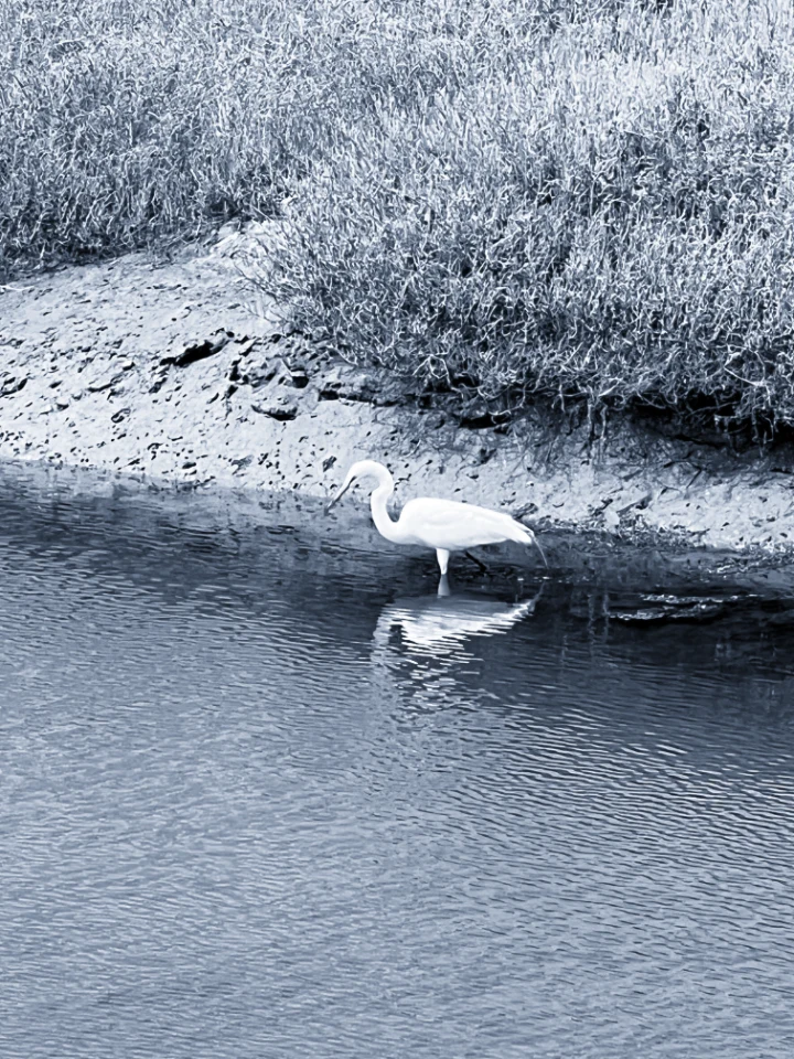
A white egret in a shallow channel with green grass and blue water.
Before A white egret stands between green grass and blue water. The original colors separate the bank from the channel.Photo: Jessica D'Ambrosio/USFWS. Public domain.
The same egret and channel in blue-gray tones after Blues at full intensity.
After: Blues, Intensity 100 The grass, bank, and water change to blue-gray tones. The white egret stays bright against the darker water.Photo: Jessica D'Ambrosio/USFWS. Public domain. Edited in Image Editor.

Compare, refine, and save

Choose Transform, then select Compare above the image to switch between the original and your edits. You can also press and hold it for a quick look. On a phone or in a narrow window, Compare is the icon beside the aspect-ratio controls. Choose Filters to continue editing.

Select Original to remove the filter, or use the reset icon beside the Filters heading (Reset filters). Changes made in Adjust, such as Exposure or Shadows, remain in place. The reset arrow beside Intensity restores the filter to full strength; it does not remove the filter.

You can use a filter together with the controls in Adjust. For example, increase Shadows to bring out a shaded subject, then return to Filters and lower Intensity if the result is too strong. See the photo adjustments guide for more about each control. To follow an edit from start to finish, see how to enhance a photo.

When you are satisfied, select Download to save an edited copy to your computer. For other ways to save, see Save and export.

All example photos are public domain. The source links in the captions identify the photographers or contributing agencies and provide the original files. Some photos were cropped to a portrait shape, as noted in their captions. Examples were edited in Image Editor and reduced in size for this page.